dinsdag 25 december 2012

Time has passed and experience came in...

It's been a while since I wrote here and although I don't mean it, I still do some work now and again (when not suffering from debilitating back injuries and other nonsense).
So heres a hellhound/hyena I've done for arecent contest:


The canvas format is that of the magic the gathering cards, so would you like to use a custom card this image will fit right in. I'm greatly thrilled when I look at this image and the progress I've made since earlier. The play of colours and detail gets a bit easier every time, but don't get me wrong I'm not confident enough yet to be able to come close to replicating this result :)

Next for a "real pokemon" contest (that already passed but I wanted to partake anyway) I took this:


And combined them into these:


A living breathing blue frog carrying a dizzying marble in it's mouth for no particular reason.
Currently I'm working on the following progress:


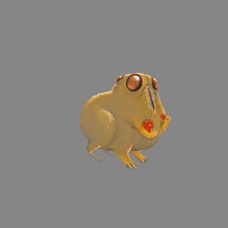
In these images you see a three eyes scurry for a contest on CGHub.com. For the image I got the following creature description:
Challenge Overview: 
The triclops' primary sense is the 3 eyes it has. It is a nocturnal little creature that gets frightened easily, so it spends much of its time looking around for predators before making any type of move. It is a quadruped with 2 smaller limbs used to handle food. (6 limbs total) All other physical traits are up to you.

A great little contest if you ask me. Go HERE to see what other people did with this description. Anyway what you see is a creature that has 3 eyes evenly spared around his skull to have 360 view (though lacking somewhat on the depth department). His eyes are set high upon it's head so they are the first to come up from it's ground burrow. It doesn't have a head persé as it's boca or mouth is situated on it's breast to load food inside it's bulbous body. Being nocturnal and day, the pupils of the creature are very tiny while it's eyes arent. The problem with it is that the creature looks very cartoonlike while my goal was for it to look realistic. Well better luck next time!

I also came up with the idea with my friend Zombieburger to have a bit of a biweekly challenge between us to stimulate our skills some more. Hope to get some of this on in the near future.

Cheers!

zondag 16 september 2012

Going out

Have had a VERY busy week this week, so little artwork was done. We are going to the "Efteling" themepark next weekend so for the occasion I made this:
The face is a painted over picture while the rest was done sloppy. The building is the entrance as it's used by the park.

I'm going to try come copy-work to better understand lighting decisions next. Wish me luck!

donderdag 6 september 2012

making miles

Another day, another drawing. I got a site named Ctrl+paint from a friend of mine which builds somewhat from the ground up. Watched alot of video's and done some of the exersizes so go check it out!

 So the first one was still one of my own. Again orbs receiving light, only this time my goal was to start with black orbs of similar size, and create location through lighting. A lightsource from the left illuminates the orbs themselves.

This image shows a photoshop exersize to practice color blending. The top bars showed the results while the lower where empty to be mixed. I did fairly well without picking the top ones I think!!

Also did an excersize using orcs to get to a nice composition. Here I blurred the orcs in the background and played with compositional balance and lighting. No movement here yet though.

Hope to get some more inspiring work done soon. See you guys later!

woensdag 5 september 2012

Excersizes


Orbs lit by a central lightsource. I added the figure for something entertaining.

Various shaped silhouettes lit by a red lightsource using a low opacity (20%) brush.
Building on something of a skull silhouet I tried to get somthing out. I ended up with the creepy zombiesc vampire head.
So today was exersize day. I had work and school so little time for the painting, but here it goes. In a followup after the moatd tutorials I started painting silhouettes and lighting these with the primairy lightsources colour using white over dark purple circles. (thought I'd selected black, but went along with the purple)
As it was taking shape nicely I added a figure for some narrative beside one of the orbs which instantly gives the picture scale.
Next I tried an exersize with a different color lightsource. Still just light over a black silhouette I painted a box, a standing cilinder, a lying cilinder, a suspended orb (no ground shadow) and a human. I think the lying cilinder needs some edge highlight on the shadowy size to show the flat surface facing away from the lightsource.

Next I tried painting a skull from a silhouette but ended up with this leering face. As I was quite satisfied with the result on its own I added some color using color layers and adding some texture detail.

Everything was done using the round brushes with shape OR opacity set to pressure. Usually putting opacity in with numerical keys. and changing hardness to encompass transitions.

maandag 3 september 2012

Starting out


Hi guys, Im posting this blog to see growth in my digital artwork. Always loved it and read and view alot about it, but now it's time for myself to improve! Right here you see some of my recent work. Not bad, I guess, but I still need a lot of training so I'll ramble and post my excersizes in an attempt to grow and improve. If you guys have any tips, and I really mean ANY, feel free to contact me as I really hope they will inprove my work.

Tomorrow I hope to post some lighting exersizes.

Let me finish with some youtube channels I'm going through right now:

http://www.youtube.com/user/imaginefx
http://www.youtube.com/user/Sycra
http://www.youtube.com/user/FZDSCHOOL
http://www.youtube.com/user/moatddtutorials